
Wednesday, November 28, 2012
real or fake?
Thursday, November 22, 2012

Saturday, November 17, 2012
My favorite image

Out of all the projects I did for digital imaging, this one would have to be my favorite becasue of the dark/intense colors for the ground, water, island, sky, and the floating tree/castle. But, there's a downside to it. You (and including myself and I was told about this by some people about it) CANNOT use any anime/manga (japanese cartoon shows/graphic novels) in your portfolio. college you plan to transfer to will not accept and refuse to look at them. So do not do it. (I did it because my project was due at the last second and had to come up with something I could do quickly without having a hassle with.)
But I'm planning on using that ground for something else (definitely not for this idea). It will be based on Once Upon A Time (and probably have unicorns in it?). I'm still thinking about it, but I really want to work on it over break.
Art Show at DCCC
As you all know, the art exhibition show is going on from now until November 30th. And, as a surprise to me, my one (and only one) work has made it.

Our digital imaging class had to make three images on technoscape (it can be anything from modern to futuristic). I think the judges picked this one because of the colors and how active it looks. I honestly have no idea why they picked it, but for whatever the reason may be I'm glad they like it.

Our digital imaging class had to make three images on technoscape (it can be anything from modern to futuristic). I think the judges picked this one because of the colors and how active it looks. I honestly have no idea why they picked it, but for whatever the reason may be I'm glad they like it.

This is what i had to work on for Color and Design. We had to make either a topographic or geometric gradient work. I stuck with the topographic and ended up with this. I was told to fix it because (1) my cuts were not good and (2) the background was not a good selection. Even though my gradients were good, I ended up with a final result of this:

Friday, November 16, 2012
Happy Birthday CBS logo!
Okay...so I was reading a section on CBS's logo for my chapter presentation and realized that the first logo appeared on November 16 in 1951, and today is November 16. So HAPPY BIRTHDAY CBS LOGO!!
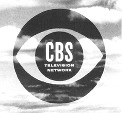 The person who created the logo, William Golden, thought of getting rid of the eyeball. It's a good thing he didn't because it is a good way of putting the name of the station in the pupil instead of somewhere else.
Friday, November 9, 2012

Subscribe to:
Posts (Atom)