Friday, December 14, 2012

critic for computer arts images

Ministry of Sound

Tom Grant
Location: Manchester, UK
Job: Illustrator and designer

Raw 5

Tom Grant
Location: Manchester, UK
Job: Illustrator and designer

Dig-In

Georgina Luck
Location: Brighton, UK
Job: Freelance designer and illustrator

Each of these images are from their monthly gallery from different designers. These three and other images show a variety how each of them are approached compared to the rest of them. The first and third image focus on color that work well or are close in value while the second image focuses only on transparency.

Wednesday, December 12, 2012

Graphic Design At Its Best

On the first day of history of graphic design, my goal for this blog was to find any graphic design concepts around me and learned a lot from that class. Now these two images were taken at the Berwyn Train Station and were suppose to be used for my very first post (but that didn't happen because a lot of graphic design related concepts were around me). I found these two images to be intriguing because the first image possessed vibrant colors on a dull background/sticker that made it a focal point instead of focusing on all the useless stuff on the background/sticker and the second image has a transparency feeling for one color (which is black) and using that same shape on a neutral color background. As a result from the class and the blog, I'm really grateful for taking this class. I learned way more about graphic design than i did when i first became a graphic design major. We have changed drastically on what graphic design is and how we view it artistically and visually towards that person.


This now and officially the end of my Graphic Design At Its Best blog. I hope you like and gained some inspiration for your current or future projects/ideas. HAVE A SAFE, RELAXING, AND SUCCESSFUL NEW YEAR EVERYONE!!!

what's growing on the tree?

This i did for my 3D design class in the spring. Out of all the projects i did for that class i thought this was my most successful one because of this ambiguitiy feeling of this color like moss/thing growing on a tree. Originally, it wasn't suppose to be on the tree; it was a sculpture. Apparently, it didn't work well like that and it couldn't stand up. So, it worked well with the tree.


amazing installation

While i was looking up images of anything art/design related about a year ago, i found this installation of these paper cranes hanging from a tree and scattered on the ground. This person took advantage of their surrounding and how to set up and place these cranes. If you look carefully, they're hung on a clear string, so the viewer will think that the cranes are floating. (I also don't know who made the installation, but it's a good reference for one of the 3D Design projects,which is the multiples project).

variety of ideas for a logo


So for this one, I thought this was interesting because the designer tried out a variety of ideas for one logo and how they went from two dimensional to three dimensional and from monochrome to gradient to rainbow from each logo. They also used line to make a pattern out of it. (I don't know the designer and the logo for it.)

look familiar?

Do these people look familiar to you?


Again i found these online and again i don't know the person who design these people. But, I personally like the little mermaid image because the person used vibrant colors on the little mermaid to look at the whole figure to the tail to the backgorund with the different shades of blue. This is also the same for cinderella: using vibrant colors for the whole figure to using the white swirls to lead your eye to look at the gray to black background. The difference between cinderella and the little mermaid is that cinderella has swirls while the little mermaid doesn't because the little mermaid's tail has the curvilinear shapes while the designer had to put in the swirls since cinderella was simplisitic.

an interesting business card


This i also found on the internet, and as you can see these are designs on a card. You're probably asking "what kinds of cards are they?" These are business cards with designs on it. It didn't say for what business, but what the designer was trying to do is to take advantage of the colors and the design of it and use it to make it appealing to the client. They took advantage of transparency, black-and-white, and geometric patterns and shapes.

a must see for color and design students

For people who are or will be taking Color and Design, this image basically describes one of the projects.


I found this image of a transparency design about a year or two ago and thought this went well with what i learned in Color and Design. Again i don't know the artist behind this design. however, I like the places where they find the transparency useful. Also, they picked colors that would vibrate along with a solid black. If you look at it closely, it starts to turn into a three dimensional form.

unusual but unique

I would go online and look up any art/design images, and there was one image of a sculpture I found one time. At first, i thought this was weird, but it turned from unusal to unique.


To be honest, I don't know the person who made it, but I like how the shadow makes an upside down "L" form with the skull and the splattered color. Even though the skull is spitting out random colors, the entire scultpure has an unusual chaotic feel to it.

Saturday, December 1, 2012

Critic for Communication Arts


Brittany Kleckner
History of Graphic Design
Professor Robert Jones
December 7th, 2012
Communication Arts Critic

            When I first thought about “Communication Arts” magazine, I thought it was about art communicating to you through different visuals. As I glanced and read the magazine, it brought you the latest information and designs about the graphic design world. They interview current graphic designers and have up to date galleries every month with a small story behind each design. “Communicating Arts” focuses on two major sections, which are its monthly galleries and current events as interviews and articles.
            When looking through “Communication Arts” galleries, you see various styles from different designers based on how they approach and set up their project or idea. Each design has a small description about the concept and process of their design; they would even have little background on the designer. At the end of each description, it shares the designer’s success from their project with the client and where they are now. If you look at each design, they use everything they learn from art school and use it to transform it into an artwork from active and busy to simple and plain. As most of us know by now, a designer is given the idea of “less is more,” which is gestalt. These designers have simplified it to the viewers that make it look like it is more. Not only were the designs a major contribution to the magazine, the current events in the graphic design world are also a major thing in the magazine.
            “Communication Arts” have the latest information as interviews and articles about a designer. They would have many interviews from any designer. If you go to their website, they would have one preview of who the magazine interviewed and how important they are by making the preview, their design, and a picture of the designer  bigger than the rest of the interviews. This signifies that this person or group is important, and it is a recommended interview to read about. At the end of each interview, they always explain how successful they are and how grateful they are for it. They also have articles on current designers and firms and new software and technology. They also have articles on designs that are either controversial or currently well known to the graphic design world. AS for new software and technologies for a designer, they give up a preview on the latest materials that a graphic designer would have like an update on an Adobe software or how to make a design on a particular software. All in all, “Communication Arts” shares plenty of information and designs to soon to be or current graphic designers in order for them to recognize that this magazine shares events and designs as inspiration.
            Because of their current events and galleries, “Communication Arts” is a useful magazine for graphic designers that want to explore new designs and learn about how a designer or firm became successful. If they wanted to look at designs from every type of designers, the magazine would display designs every month to show to the viewers what they created and their story behind it. There is current information about the designer or the firm, and they would get the viewer’s attention with either a design that a person did or an interesting article title with a preview of what the whole article is about. For soon to be or current graphic designers, “Communication Arts” is for people who want to explore the endless inspirational designs and interviews that will help a graphic designer be successful. 

Wednesday, November 28, 2012

my all time favorite design from Moore

Out of all of his work, this one has got to be one of my favorites of all time:

Moore used the same design, but he used color and black-and-white to see the difference. It's obvious they have the same pop art feeling, but the one on the left has glows from the lighter colors while the black-and-white one feels more like you're being sucked in. I think Moore made a good decision about making two of the same design but change the colors and see if one says a complete different story than the other one.

If you want to learn more about his work, check out http://mwmgraphics.com/index.html. I will say this much: you will not be disappointed with his works. They are amazing!

moore's logos and designs

Matt W. Moore does more both logos and designs. I thought these logos were interesting and unique.

He uses line weight to this logo but reflects it on the other side by chaning the line weight from the middle outward (thick to thin).

He also did this as well, which left me curious about why he did this design and wha it meant.

I think it means that he wants world peace because the peace sign is next/wrapped around the earth.
If you want to see more of Moore's logo designs, go to http://mwmgraphics.com/logos_branding.html.

Moore works mostly with design. But these apparel/art designs forcused more on either color, geometry, or both.


Each one of these images focuses on how he uses the shapes, colors, and/or type to his advantage. He's mostly careful with color this situation because I think he wants us to look at its intricate details or its simplicity.

He did more than just these designs. If you're curious abou it, go to http://mwmgraphics.com/fashion_apparel.html to check it out.

the google logo

Whenever we go on google we always see its logo changed from a different shape to a completely new look. Well, while I was looking up an artist for my color and design class, I found out he was one of the designers who did this:


Matt W. Moore is the designer/artist who made this google logo. I really like how he uses the circles as line weight or end points for each letter. For example, if you look at the "G," you can notice that the top and where it starts to curve it gives emphasis that it's a "G."

This is not the only logo he made for Google. If you're curious about his google logo designs, go to http://mwmgraphics.com/typography_google.html to look at them.

real or fake?

I found this image from instagram and thought this was interesting. You leave yourself questioning whether it's real or a painting because the little girl is using the fire distinguisher to eliminate the dragon's fire.

Thursday, November 22, 2012

So i found this picture on facebook and thought this was funny that has meaning. The artist uses the objects to make a word we would get automatically and laugh about it. I also like the two colors the artist uses to make the objects two dimensional; it also gives it a birds eye view of it too.

Saturday, November 17, 2012

My favorite image


Out of all the projects I did for digital imaging, this one would have to be my favorite becasue of the dark/intense colors for the ground, water, island, sky, and the floating tree/castle. But, there's a downside to it. You (and including myself and I was told about this by some people about it) CANNOT use any anime/manga (japanese cartoon shows/graphic novels) in your portfolio. college you plan to transfer to will not accept and refuse to look at them. So do not do it. (I did it because my project was due at the last second and had to come up with something I could do quickly without having a hassle with.)

But I'm planning on using that ground for something else (definitely not for this idea). It will be based on Once Upon A Time (and probably have unicorns in it?). I'm still thinking about it, but I really want to work on it over break.

Art Show at DCCC

As you all know, the art exhibition show is going on from now until November 30th. And, as a surprise to me, my one (and only one) work has made it.


Our digital imaging class had to make three images on technoscape (it can be anything from modern to futuristic). I think the judges picked this one because of the colors and how active it looks. I honestly have no idea why they picked it, but for whatever the reason may be I'm glad they like it.
This is what i had to work on for Color and Design. We had to make either a topographic or geometric gradient work. I stuck with the topographic and ended up with this. I was told to fix it because (1) my cuts were not good and (2) the background was not a good selection. Even though my gradients were good, I ended up with a final result of this:
I really like this one becaus the grey scale background makes the colored pieces pop out and the last strip in teh background fades and turns into the border.

Friday, November 16, 2012

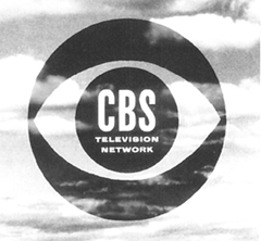
Happy Birthday CBS logo!

Okay...so I was reading a section on CBS's logo for my chapter presentation and realized that the first logo appeared on November 16 in 1951, and today is November 16. So HAPPY BIRTHDAY CBS LOGO!!

The person who created the logo, William Golden, thought of getting rid of the eyeball. It's a good thing he didn't because it is a good way of putting the name of the station in the pupil instead of somewhere else.

Friday, November 9, 2012

GOOGLE

I thought this was a clever way of replacing the letters with objects, so that the viewer knows they can read the letters easily. I used this technique for my current illustrator project by replacing the O's with doughnuts for my title, which is "FOODIES." It also gives the title a loose and relax feeling instead of its serious, bold colors.

Wednesday, October 31, 2012

Variety of logos

For this tv show, they always have the same logo. BUT, they always change it a little, but still retain the whole logo. They use the same colors and background of the logo, but they add different objects to it.

Advertisement with good color

When i first saw this ad for a tv show, i fell in love with it. Not because it's a good show, it's the colors and the placement of the objects and how it's percieved. They used opposite colors and used textures very well like the squashed apple.

Friday, October 26, 2012

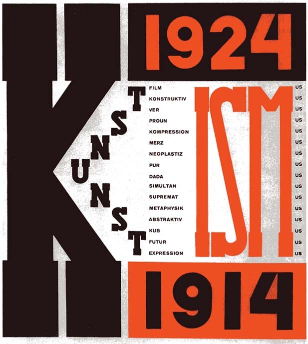
While I was doing my research on El Lissitzky, I noticed that he uses mostly blacks and reds in his work (and some white as well).


I think he uses those colors in order for the viewer's eyes to notice the red and then the darker values. He also considers type as well to get variety in there instead of simplicity.