Surprisingly enough they didn't put this on TV. I thought it was a good way to promote how much we want to thank the soldiers for what they did for us. The colors they used and how they took advantage of them captures your attention for a long period of time.
Thursday, September 27, 2012
A Must See (from a football game)
You know how some football games show respect for our veterans? Well this one shows how the stadium (on the day of the game) shows respect to them. The people put the letterings and design together on ALL of the seats in order to create this:
Before & Now
I know I haven't been keeping my blog up to date. So I do apologize for that.
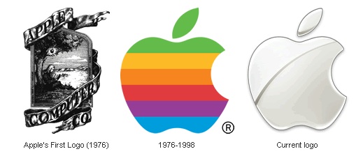
But something from my history of graphic design class made me wonder what the Apple company's logos were like in the past. Surprisingly enough their first logo in 1976 reminded me of how other company's logos were (complex and detailed). I never knew that logo would change so drastically because of the way the colors are positioned. Usually we think of purple or red first and then work our way down. I think this is to get our eye's attention with the vibrant warm colors first and then the cooler ones last. As for the last one, it's just to make a statement, which is its sleek and shiny features to say that the apple now is the future.
But something from my history of graphic design class made me wonder what the Apple company's logos were like in the past. Surprisingly enough their first logo in 1976 reminded me of how other company's logos were (complex and detailed). I never knew that logo would change so drastically because of the way the colors are positioned. Usually we think of purple or red first and then work our way down. I think this is to get our eye's attention with the vibrant warm colors first and then the cooler ones last. As for the last one, it's just to make a statement, which is its sleek and shiny features to say that the apple now is the future.
 |
| Apple logos |
I saw this sign. They were promoting a new burger at Wendy's. And I thought it was hilarious. It's basically promoting something smaller with something bigger, BUT the way it's advertised is funny. Take a look!
Thursday, September 20, 2012
On my way home from college, my mom and I saw this sign:

She told me that it was kin of disturbing because when you eat something, you barf it out. People who made this sign may have a different meaning than what other people think it means.

She told me that it was kin of disturbing because when you eat something, you barf it out. People who made this sign may have a different meaning than what other people think it means.
Wednesday, September 19, 2012
something hiding in a logo
So my grandma sent me an email about logos and how unique they are. one of them was a fedex logo. if u look between the "e" and the "x" there's an arrow.

I don't know if you gusy know this one, but for the dorito logo there are two t's sharing tortita chips.

For the Baskin Robin's logo, there's a number "31" in the "b" and "r".

For the good will logo, the smiley face is a "g" for goodwill.

Those are the ones that caught my attention becasue those are things that I never recognized or realized before until now.
I don't know if you gusy know this one, but for the dorito logo there are two t's sharing tortita chips.
For the Baskin Robin's logo, there's a number "31" in the "b" and "r".
For the good will logo, the smiley face is a "g" for goodwill.
Those are the ones that caught my attention becasue those are things that I never recognized or realized before until now.
Thursday, September 13, 2012
same design concept spreads
Is it just me or is every social media app using the same design?
I can understand that this is the new trend for designers, but it's annoying for me to see this type of design. It's just one letter with a slightly different look. The letter is positioned differently and the font is different.
 |
| Twitter app icon |
| Facebook app icon |
 |
| Tumblr app icon |
Tuesday, September 11, 2012
 |
I thought this was a good example of a logo design that can have a different meaning than what the company intended to be. This logo can have many meanings, but the one I can think defines it (and I know a lot of who thought of it this way) is that the "Pour House" can be interepeted as a bad restaurant. The "Casey's" design has been around since I first visited the restaurant, but how you define it can change the way the person thinks or views it.
Saturday, September 8, 2012
An Advertisement/Art Cultural Reference in America

His artwork uses vibrant colors by creating two dimensional cartoons and sculptures. These are a couple of his work if you're not familiar with him. For more information on him, go to http://www.takashimurakami.com/ .
 |
|
 |
| Takashi's flower ball along with his wallpaper of flowers with another room of his painting. |
Subscribe to:
Posts (Atom)


