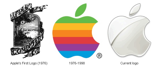
But something from my history of graphic design class made me wonder what the Apple company's logos were like in the past. Surprisingly enough their first logo in 1976 reminded me of how other company's logos were (complex and detailed). I never knew that logo would change so drastically because of the way the colors are positioned. Usually we think of purple or red first and then work our way down. I think this is to get our eye's attention with the vibrant warm colors first and then the cooler ones last. As for the last one, it's just to make a statement, which is its sleek and shiny features to say that the apple now is the future.
 |
| Apple logos |
No comments:
Post a Comment