Wednesday, October 31, 2012

Variety of logos

For this tv show, they always have the same logo. BUT, they always change it a little, but still retain the whole logo. They use the same colors and background of the logo, but they add different objects to it.

Advertisement with good color

When i first saw this ad for a tv show, i fell in love with it. Not because it's a good show, it's the colors and the placement of the objects and how it's percieved. They used opposite colors and used textures very well like the squashed apple.

Friday, October 26, 2012

While I was doing my research on El Lissitzky, I noticed that he uses mostly blacks and reds in his work (and some white as well).


I think he uses those colors in order for the viewer's eyes to notice the red and then the darker values. He also considers type as well to get variety in there instead of simplicity.
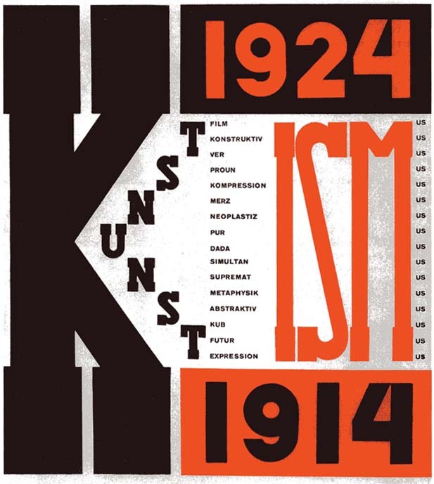
At first when I first saw El Lissitzky's artworks, I thought at first they were related to graphic design. This was the reason why:

This picture used a variety of type and uses grey scale colors and red. He uses black, white, and red in almost all of his work, so that your eye is focused on the red (for example, the red triangle because it's big and noticeable).

Sunday, October 14, 2012


I thought this was amazing. An illusion to make the man's painting look like this a part of the setting. This was on one of Clay's Bakery tables as well.

I remember in class (and from someone's blog) discussing about typography. While I was at Clay's Bakery, I found some typography on their table. The word used an object or a style to make it two words. I found this interesting because it reminded me on how I used the four leaf clover for my playing card to make it look like the number 7. By changing a word with just one object or symbol can change the look and definition of it as well

Friday, October 12, 2012

intriguing? i think so...

I was looking at other blogs until I ran across this one.


This reminded me of someone's image of Superman coming out of a hole and the whole design was on a pavement. Not only does trick your eye, it also reminds me of a friend of mine who loves Batman and Robin.

Thursday, October 11, 2012

Best Way to Grab Your Attention

I found this magazine amazing! Not because of Venice. It's because their title matches with the photograph on the cover. They also made the phrase more noticable by using bright colors and a large font (not bigger than the title). It's a good design concept to get the audiences' attention.
While I was at the mall last week, I saw these hand sanitizers. BUT, the colors the store had were incorporated with a color that matched with the design of their product. The colors not only capture your attention, but it also makes you think that the colors match perfectly with the design of the product.

Thursday, October 4, 2012

Did you know?

When I was reading chapter 11 last night, I have never knew this logo was around since the 1900s.


General Electric trademark by A.L. Rich, c.1890 

The curvilinear shapes and typeface flows with the circle. I think the reason this is still around is because it's not only has a modern feel to it, but it also has a simplisitic feel to it.